How colors influence our mood
In Germany, we have only known how to make apartments more individual and cozy by using colors or wallpaper since the beginning of the economic miracle. Suddenly, walls couldn’t be colorful or garish enough. At the time of the kidney table and bag lamp, gaudy shades of brown or green in combination with orange also found their way into our homes.
Today, the color combinations are no longer quite so quirky and are better coordinated. In the meantime, there are entire branches of research that deal with the psychology of colors in living spaces.
The most important finding is that when used correctly, colors create a real sense of well-being. A mixture of calming and stimulation is ideal, say the color experts. Make sure therefore to arrange their walls predominantly with neutral colors such as lime or sun tones. These colors have a rather calming effect. Discreetly Combined with more intense colors, you create the right balance between calm and excitement.
Furniture supports color tones
Also pay attention to the right mix of colors when furnishing your home. For example, the combination of dark furniture and dark brown wall color tends to create a gloomy, restless mood. Instead, use cream or light blue furniture that subtly contrasts with the wall color. If you like it stronger, an autumn-looking rusty red makes a wonderful accent
For furniture and other furnishings, we are currently experiencing a trend for soft tones: for example, a pink with shades of beige. Gray and black are also popular, mixed with blue, green or red.
For sofas, green in a wide variety of shades and olive green in particular are very much in vogue. Also Petrol and turquoise are at present particularly popular colors, report experts of the German furniture industry.
Long time dominated dwellings in simple white. The many white are humans however in the meantime tired. Nevertheless no gaudy Pop kind colors are in demand, so the color experts. Much more it gives with humans the longing for more harmony and homeland. Therefore rather a sunny, toned down, soft yellow comes to use.
Wallpapers: More than woodchip
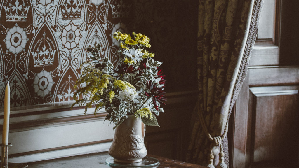
Auch bei Tapeten neigen die Menschen zu dezenten Farben, beispielsweise zarte pastellige Töne mit floralen Mustern. Warme Farben seien aber weiterhin gefragt. Rot- und Terrakottatöne gestalten einen Raum gemütlich.
Und was die Oberfläche angeht, da sind besonders Struktur-Tapeten gefragt. Menschen lieben es, beim Gleiten mit der Hand über die Tapete die dreidimensionale Struktur zu erfühlen. Manche Tapete erinnern dabei beispielsweise an alte Kacheln einer italienischen Landhausküche aus dem 19. Jahrhundert.
Auch wir achten bei der Auswahl unserer möblierten Apartments auf eine gesunde Harmonie zwischen ruhig und laut. Denn egal ob in den eigenen vier Wänden oder beim Wohnen auf Zeit: Wir halten uns durchschnittlich zu 80 bis 90 Prozent des Tages in Innenräumen auf.
Testen Sie uns!
Sind Sie gerade auf der Suche nach einem möblierten Apartement? Wir als Wohnexperten im Raum Essen und Umgebung finden im persönlichen Gespräch Ihre perfekte Wohnung auf Zeit. Auf Basis Ihrer Wünsche vermitteln wir Ihnen schnell und unkompliziert eine passende und gemütliche zweite Heimat.